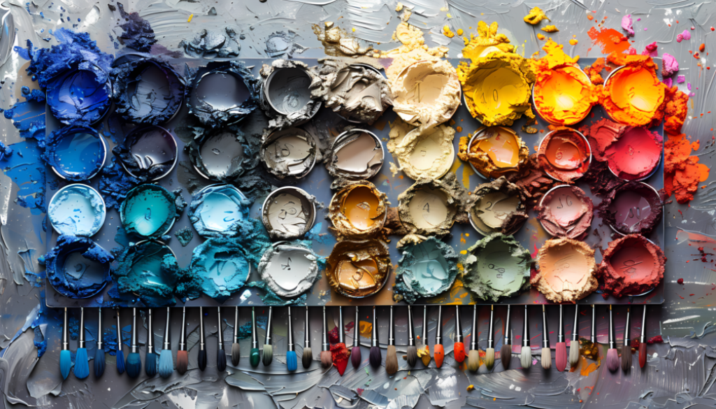
Colorful Palette Mastery: 10 Expert Tips for Crafting Stunning Visual Designs
Colorful Palette. Whether you’re a seasoned pro or just dipping your toes into the design pool, mastering the art of color can take your visuals from meh to mind-blowing. So, grab your favorite beverage, and let’s chat about how to level up your color game.
Start with a Color Story
Ever notice how some designs just feel right? That’s because they’re telling a color story. Think about the vibe you want to create. Calm and serene? Bold and energetic? Your colorful palette is the narrator of your visual tale.
For example, when I was working on a beach resort project, I didn’t just slap on some blue and call it a day. I thought about the feeling of sand between your toes, the warmth of the sun, and the cool ocean breeze. That led me to a palette of soft sandy beiges, warm coral, and various shades of blue. The result? A design that practically screamed “vacation mode: activated!”
Embrace the Colorful Palette
Remember that color wheel from art class? It’s time to dust it off and put it to work. The color wheel isn’t just a pretty circle – it’s your secret weapon for creating harmonious colorful palettes.
Here’s a quick refresher:
- Complementary colors: Opposite on the wheel, they create high contrast and pop.
- Analogous colors: Next to each other, they’re harmonious and easy on the eyes.
- Triadic colors: Evenly spaced around the wheel, they’re balanced yet vibrant.
Play around with these relationships. You might surprise yourself with the combos you create!
Less Colorful Palette is More (Usually)
I get it, it’s tempting to use ALL the colors. But trust me, restraint is your friend. A focused colorful palette of 3-5 colors can pack more punch than a rainbow explosion.
Think about some of the most iconic brands. Apple? Black and white with a touch of color. McDonald’s? Red and yellow. They’re not trying to win a contest for “most colors used.” They’re creating memorable, impactful visuals with a limited palette.
Consider Context
Colors don’t exist in a vacuum. The same yellow that looks cheerful on a children’s toy website might look sickly on a health food blog. Always consider where and how your colors will be used.
I once made the mistake of using a bright, energetic colorful palette for a meditation app. Feedback? “It’s stressing me out just looking at it!” Lesson learned: context is king.
Test Drive Your Colorful Palette
Don’t just admire your colorful palette in isolation. Take it for a spin! Apply it to mock-ups, test it on different backgrounds, see how it looks on various devices.
Pro tip: Check how your colors look in grayscale. If they’re too similar in value, you might lose important contrast when printed in black and white or viewed by someone with color blindness.
Embrace Tools and Technology
We’re living in a golden age of color tools, folks. From Adobe Color to Coolors.co, there are tons of free resources to help you generate and refine colorful palettes.
My personal favorite? The good old eyedropper tool. See a color you love in the wild? Snag it and build a palette around it. Nature, art, photography – inspiration is everywhere!
Don’t Forget Accessibility
Here’s something that often gets overlooked: color accessibility. Your stunning design isn’t so stunning if people can’t read it or understand it.
Always check the contrast ratio of your text colors against backgrounds. There are plenty of free tools online to help with this. Trust me, your users (and their eyes) will thank you.
Create a Flexible System
A great colorful palette isn’t just a set of pretty colors – it’s a system. Think about how your colors will work together in different combinations and proportions.
I like to create a primary palette of 2-3 colors, then a secondary palette of 2-3 more. This gives me flexibility while keeping things cohesive.
Learn from the Masters of the Colorful Palette
Want to level up your color game? Study the greats. Look at how artists, designers, and even filmmakers use color. Wes Anderson films, Van Gogh paintings, iconic album covers – they’re all masterclasses in color usage.
Practice, Practice, Practice
Like any skill, mastering colorful palettes takes practice. Challenge yourself to create a new palette every day, or try recreating palettes from designs you admire.
Remember, there’s no “perfect” colorful palette. It’s all about what works for your specific project and audience. So don’t be afraid to experiment and trust your gut!
There you have it, folks – your crash course in colorful palette mastery. Remember, at the end of the day, color is all about evoking emotion and enhancing communication. So have fun with it, trust your instincts, and keep experimenting. Your perfect colorful palette is out there waiting for you to discover it!
FAQs
How many colors should be in a colorful palette?
While there’s no hard and fast rule, a good starting point is 3-5 colors. This usually provides enough variety without becoming overwhelming.
Can I use black and white in my colorful palette?
Absolutely! Black and white (and shades of gray) can be powerful additions to any colorful palette, providing contrast and balance.
How do I choose colors that work well together?
Start with color theory basics like complementary or analogous colors. Use online tools to generate palettes, or draw inspiration from nature, art, or photography.
Should my colorful palette stay the same across all my designs?
While consistency is important for branding, don’t be afraid to adapt your palette for different projects or audiences. The key is to maintain a cohesive feel while allowing for flexibility.
How can I make sure my colorful palette is accessible?
Use online contrast checkers to ensure text is readable against backgrounds. Consider how your palette looks in grayscale, and be mindful of color blindness issues.


